Table of contents
Introduction
Flutter is known for its cross-platform support in a single codebase. Every device has different dimensions which lead to different screen sizes. You have to keep that in mind while building your UI. Today, we will have a look at that thing itself. We will see how you can build a responsive UI for screens of any size.
There are a lot of packages out there to do this but we will do it by using Flutters' own Layout Builder. This is probably the best way to build a responsive UI for Beginners in Flutter.
Code
We don't need to add any external package today. So let's jump straightaway into the coding part. Clear up all the code of your demo project. Now, in the widget build function, instead of returning a scaffold, return a LayoutBuilder. This is what your code should look like.
@override
  Widget build(BuildContext context) {
    return LayoutBuilder(builder: (context,constraints){
// constraints is the parameter which tells us about the dimensions of the device on which our app is running currently
      if(constraints.maxWidth<600)
      {
        return MobileUI();
      }
      else {
        return DesktopUI();
      }
    });
  }
600 is the general width of our mobile device. So if our current device's width is less than 600, we will return a MobileUI. Or else, we will return a Desktop UI. You can create another if statement for a Tablet UI as well. You can store the widths in variables and then use them in your UI accordingly.
Now, just create two more stateless or stateful widgets. One will be named MobileUI and the second will be named DesktopUI. You can create a different dart file and create both these widgets in them. In the build function of mobile UI, add these lines of code.
return  Scaffold(
backgroundColor: Color(0xffe5e5e5),
body: Column(
children: [
Container(
color: Colors.teal,
width: 200,
height: 200,
            )
     ],
  )
);
In the build function of desktop UI, add these lines of code.
return  Scaffold(backgroundColor: Colors.black,
body: Column(
children: [
Container(
color: Colors.white,
width: 200,
height: 200,
   )
  ],
 ),
);
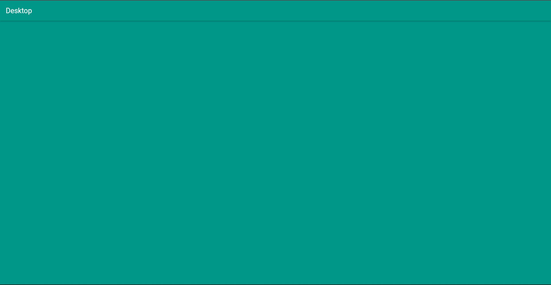
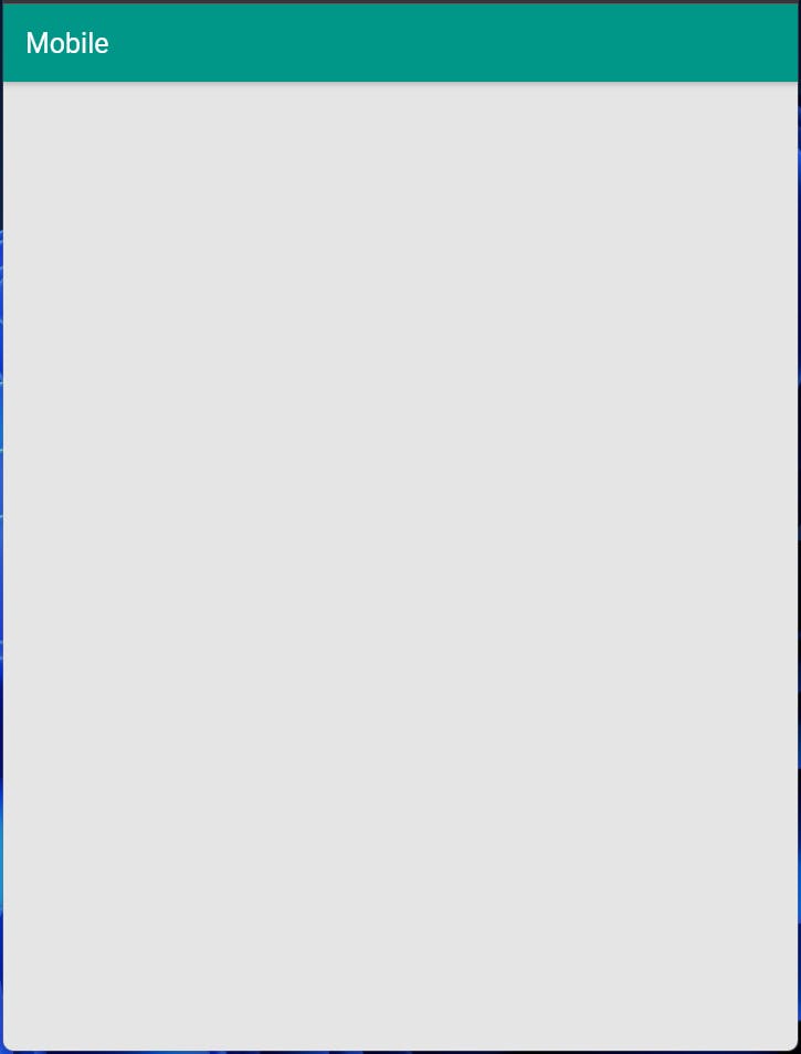
You can see, there is a difference in the background color of the Scaffold and in the Container color. When in desktop mode, the color scheme will be black and white, and in Mobile mode, it will be off-white and teal.


Run your app. Do not run it on a mobile device. Run it on Chrome. To run your app in chrome, type this command in your integrated terminal.
flutter run -d chrome
If you are unable to run it on chrome, then first type this command.
flutter config --enable-web
Now run the flutter run -d chrome command. You should be able to run the app on chrome successfully now.
So this is how we can create more than one UI depending upon the dimensions of your screen. Whatever you have planned to show in mobile, add it in your MobileUI widget and whatever you have planned to show on desktop, add it in your desktop UI widget.
Conclusion
So with this, we conclude our tutorial on how to use Layout Builder to render different widgets depending on the current device's screen. I have just shown how to build the template for more than one device size. Now, try to make your UI responsive for any of your personal projects.
You can appreciate and support my blogs via.

Also, let's connect on Twitter. Follow CSwithIyush for more amazing tutorials, tips/tricks on Flutter & DSA.

