


Table of contents
Introduction
In today's world, almost every app has a light and dark mode system. Ever wondered how do they execute this in their app? If yes, then today we will have a look at the answer to this question.
Today, we will add a light and dark mode theme to a Flutter app. Not only that, we will also see how we can persist the users' preference using Shared Preferences. Don't know what is Shared Preference? Go check out this article.
Themes in Flutter
Themes are an integral part of UI for any application. Themes are used to design the fonts and colors of an application to make it more presentable. In Flutter, the Theme widget is used to add themes to an application.
With the help of this ThemeData class, we will add two different themes to our app. So let's get started.
Project Setup
There is not much to set up in this app. All we need is the shared preferences package. Add this line of code in your pubspec file.
dependencies:
  shared_preferences: ^2.0.13  // Add this line
Now, in your main.dart or wherever you are writing your logic, import the package. Like this,
import 'package:shared_preferences/shared_preferences.dart';
That's it. Now let's move to code the logic.
Coding Logic
We will break down the whole process into 3 simple steps.
- Create two ThemeData objects. One for light and another for dark. Then use them in our Material App.
- Create a Switch widget to toggle between these two themes
- Use Shared Preferences to persist the current theme.
Let's start with step number 1. Create a new dart file called constants.dart. Now in that file, add the following piece of code.
import 'package:flutter/material.dart';

// tells us the current theme preference of the user. Initialized with true
bool isDark=true;

// The themedata that we will use in dark mode.
ThemeData darkTheme = ThemeData(
  brightness: Brightness.dark,
  primaryColor: Colors.amber,
);

// The themedata that we will use in light mode.
ThemeData lightTheme = ThemeData(
    brightness: Brightness.light,
    primaryColor: Colors.blue
);
Now in your main.dart file, In the MaterialApp, add this line of code. Make sure that you are using a stateful widget and not a stateless widget.
 return MaterialApp(
  title: 'Flutter Demo',
 // is isDark is true, we will use the dark mode theme else we will use the light mode theme.
  theme: isDark==true?darkTheme:lightTheme,
  darkTheme: darkTheme,
  home: YourApp()
);
This concludes step number 1. Now if you start your app, your app will start in dark mode. This will happen because isDark is set to true. If you change the value of isDark and hot restart, the app will be in light mode.
In step 2, we will create a switch widget. The switch is an in-built widget provided by Flutter. Just create a scaffold and in its body, create a column. In the column, add a Text widget and below it add a Switch widget. Something like this,
 Scaffold(
    body: Column(
    mainAxisAlignment: MainAxisAlignment.center,
    children: <Widget>[
     const Text(
          'You have toggled the switch',
     ),
     Switch()
   ],
 ),
),
The switch widget needs a value and an onChanged function. The value of the switch will be isDark. If the isDark is true, the switch will be on and if false, the switch will be off. In the onChanged function, we will store the current value of the switch in isDark. The code will look like this.
value: isDark,
onChanged: (toggle) {
// we setState because we want to render the change in isDark's value.
      setState(() {
      isDark = toggle;
      });
}
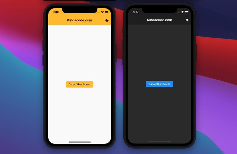
This concludes step 2. If you hot restart your app again, you will see a switch on the screen. If you toggle it, you will see your app's theme changing from dark to light mode and vice versa.
If you have made it this far, then CONGRATULATIONS!!. You have successfully learned to add a light mode and dark mode to your app.
Now we are going to do an additional task i.e we will try to persist this theme. We will do this with SharedPreferences. If you have read my article on shared preferences and if you want to try it out on yourself, then do try it. It will be a good practice task. If you are stuck or don't want to do it on your own, then just enjoy reading ahead.
First of all, let's create two new functions. saveTheme and getTheme. SaveTheme function is to save the current theme in shared preferences and getTheme is to get the current theme when the app is restarted. Here is the code for both the functions
  _saveTheme() async{
// create a new instance of sharedpreference
    final _prefs = await SharedPreferences.getInstance();
// map the key 'theme' to value of isDark. It will either be true or false.
    prefs.setBool('theme', isDark);
  }

  Future<bool> _getTheme() async{
// create a new instance of sharedpreference
    final _prefs = await SharedPreferences.getInstance();
    setState(() {
// if the value mapped to 'theme' is null, make isDark to true.
      isDark = _prefs.getBool('theme')?? true;
    });
    return isDark;
  }
As you can see, the getTheme function returns a future. So in order to not get any errors, we will need a FutureBuilder wherever we are going to use it. In this case, we need the value of the shared preferences from the start. So we will wrap our MaterialApp with FutureBuilder. Here is how we do it.
FutureBuilder<bool>(
 future: _getTheme(),
// snapshot will contain whatever value the _getTheme() returns.
 builder: (context, snapshot) {
 if(snapshot.hasData) {
      return MaterialApp(
      home: // Rest of the code.
);
 }
  return CircularProgressIndicator();
 }
);
Now, whenever our app restarts, the FutureBuilder will wait for the getTheme function to return a value, and then it will build/render the whole widget tree.
Now, let's see how we will update our value in shared preferences. If you remember, we are changing the theme of the app whenever we toggle the switch. So in the onChanged function, we will call the _setTheme() function and that will do our work.
Switch(
// snapshot has the value of 'theme' key which tells us the current theme of our app
  value: snapshot.data,
  onChanged: (toggle) {
   setState(() {
   isDark = toggle;
  });
// call the _saveTheme function and save the current user preference in the shared preference.
 _saveTheme();
})
And that's it. HOORAY!! Here is what you have learned so far in this article.
- How to create different themes in a single app
- How to toggle themes with the help of a switch
- How to use shared preferences to persist the theme of the app locally.
That was a lot to do in a single article I guess. You can now play around with your ThemeData object and add different colors and test the app.
If you are a visual learner, then watch this video tutorial below
Conclusion
So this concludes our article on how to create a light and dark mode theme in your Flutter app and persist it with the help of Shared Preferences. I hope you were successful in creating this feature. I also hope that you learned something new today.
You can appreciate and support my blogs via.

Also, let's connect on Twitter. Follow CSwithIyush for more amazing tutorials, tips/tricks on Flutter & DSA.